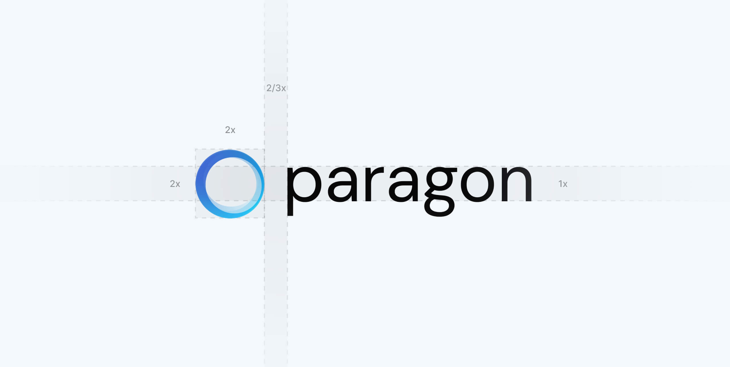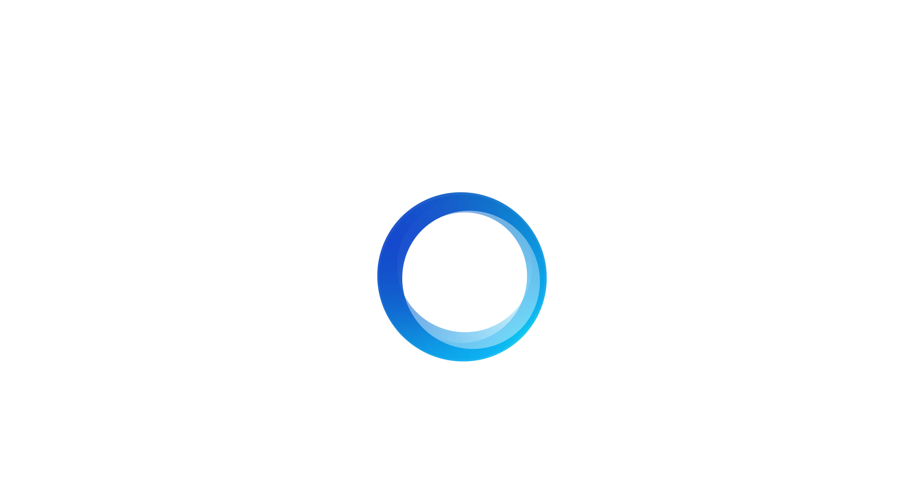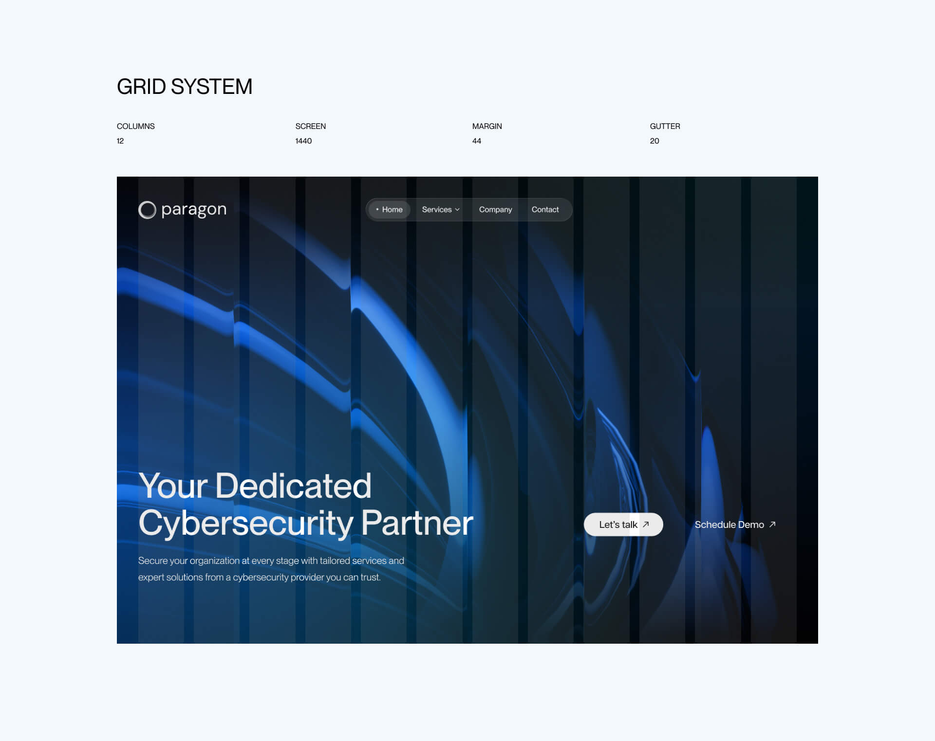
Paragon, a cybersecurity company, needed an identity that reflected precision, trust, and constant evolution. The name itself means “perfect,” yet perfection is something that can only be pursued, never reached. We built the idea around this paradox — a circle that tries to be perfect but never fully closes. It represents a brand that’s always improving, learning, and protecting in motion.
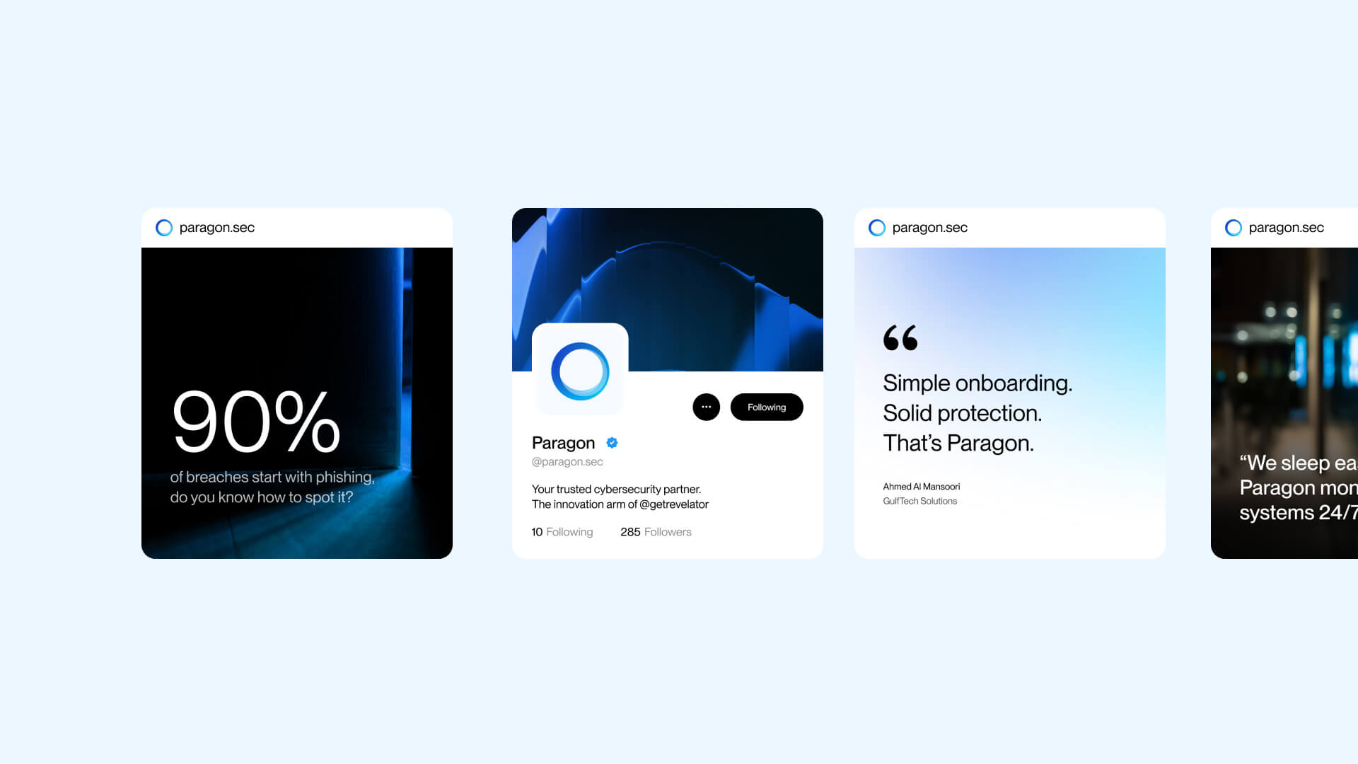
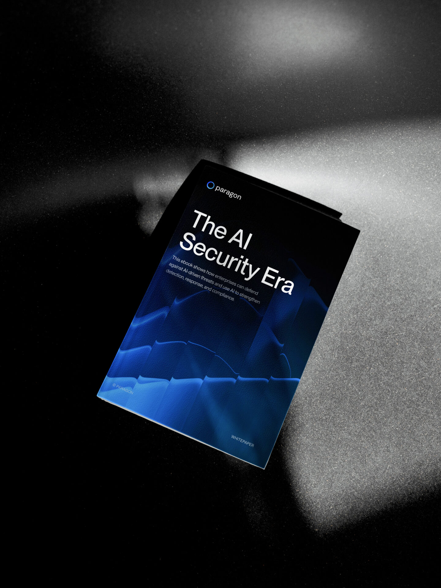
From this symbol, we created a complete design system — logo, typography, and color — shaping a clear, human-centered identity. Human Made extended it across social media, investor materials, and the website paragonsec.io, where the brand’s calm confidence and technical rigor come together.
The result is a timeless visual language that embodies cybersecurity’s essence: precision with a human edge.